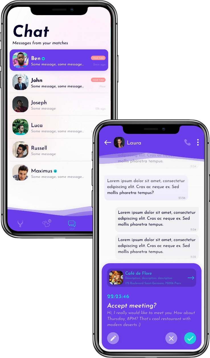
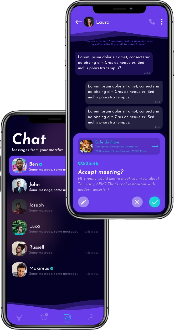
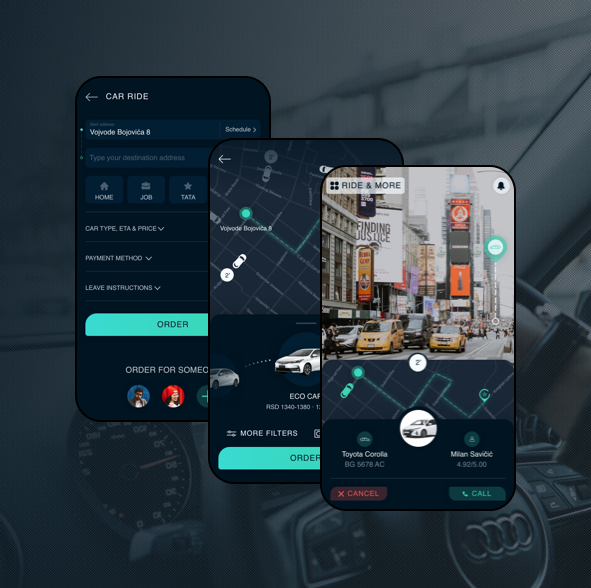
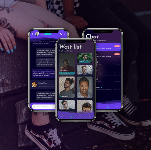
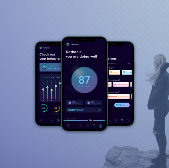
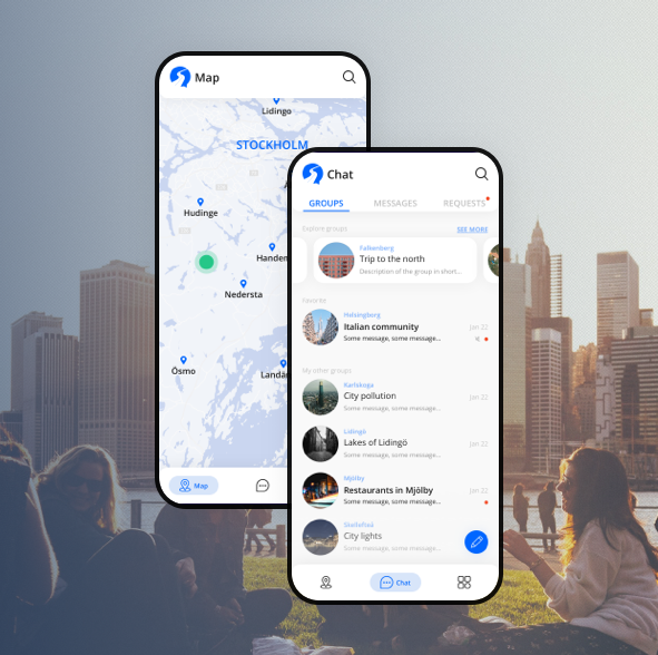
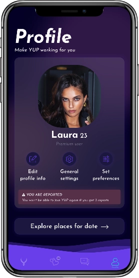
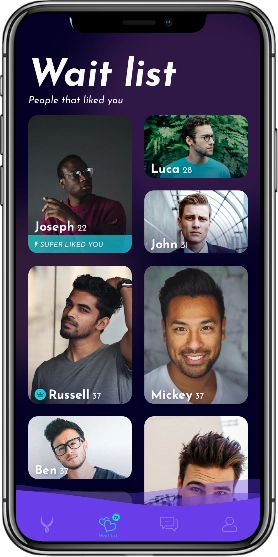
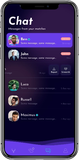
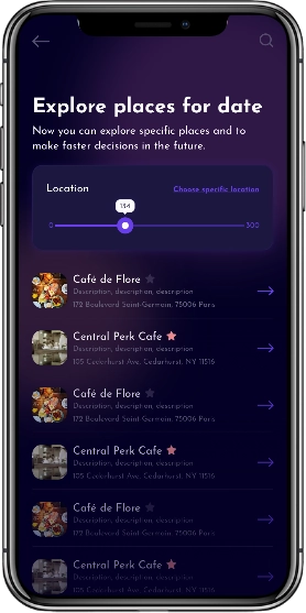
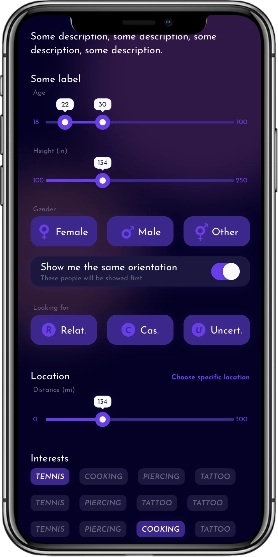
The mobile app

The client's idea was to stop wasting the users' time and to make some constraints by "forcing" users to make a decision. So, users can freely chat for a few days, and then the modal will appear that will ask users are they interested in meeting face to face. If both of them answer positively, the first who liked will choose one activity, and the other participant will find a specific place that follows the chosen activity.

phone mockup

PROFILE

All important options for the user, like editing the profile, setting the filter, general settings, and exploring places.

phone mockup

WAIT LIST

Here will be displayed people who super-liked and liked the user in the interesting layout.

phone mockup

CHAT

Only matches are displayed in the chat, which means that here are shown people that liked each other.

phone mockup

EXPLORE PLACES

The user will be able to search places through specific activities. Also, user will be able to see his bookmarked places.

phone mockup

SET PREFERENCES

The user can set up the general filter for what he/she/it is looking for. It can be set up from interest to location.

Light & dark mode

We are trying to provide the full experience and to let our users choose the theme they prefer. Other than that, we tried to make this app distinguishable by using different animations in the JSON format - so we have bottom navigation that is wavy, while all the time we have blurred circles in the background that are moving a little bit. Isn't this app engaging?

Yup light mode Yup dark mode

Yup or nope?

This screen is inside the wait list, where are users that liked some specific user. When that specific user clicks on someone's image, this screen will be displayed, so he/she/it can see more info. And also there are 3 CTA buttons - deny, like, and super like. At the end of the screen, there is a possibility to read some message if there is any.

1CTA Buttons

Like in almost all dating apps, there are three possibilities - deny, like, or super like.

2More info

There is all info, like images, name, age, subscription badge, height, interests, and some description.

3Read message

Users are able to read one message (similar to a link request) from persons that super-liked this user.

1Back

Any time, if a user is not ready to decide what action he/she/it should take, can go back.

Yup app image
circles

Style guide

We wanted to use an interesting layout in combination with compatible colors and font, and to show from the first look that this is a dating app. From the beginning, we knew that there will be light and dark theme, so we chose accent colors to be accessible on both themes. Also, we chose this font, to make this app look lovely and recognizable.

Colors

Dark theme

accent1

#FF9595

arrow

accent2

#28DDC7

arrow

accent3

#693EEA

arrow

accent-light

#BFAEF3

arrow

text

#040026

arrow

light

#CAC9D1

arrow

background

#FAFAFA

arrow

INVISIBLE

arrow
arrow
arrow
arrow
arrow
arrow
arrow

Light theme

accent1

#FF9595

accent2

#28DDC7

accent3

#693EEA

accent-light

#3D288B

text

#FAFAFA

light

#514D69

background

#040026

Typography

Gill Sans
Font Family

Weights

Regular

Medium

Semibold

Bold

Sizes

Font size 24, line height 32

Font size 20, line height 28

Font size 16, line height 24

Font size 12, line height 18

greequote

Always provide more than we have asked for, and that is great because they understand our problems and deliver strong solutions.

Luca Kahn
Founder & CEO of Yup

More projects