

We have created a totally scalable server environment for the Linguado platform. Since we have a huge number of users, we are using a Load Balancer, and a couple of servers for API calls. We are tracking the server’s activity in real-time, and whenever we detect bigger activity than expected we can easily add more servers and therefore avoid any server cluttering. See the main features below.

User can to find and filter other users by their nationality, language(s) they speak, and age, gender, or location.

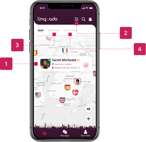
See Linguado users nearby, or around the globe. By clicking the flag, more info about that user will appear.

With an interactive translator, and text & audio message capabilities, we are immersing users in the conversation.

Creating more connections between different Linguados through video or audio calls.

With one click, users can discover interesting facts about the partner’s country.
Since we have proven that this app is worthy, it was time to redesign the user experience. By adding new features that our users have asked for (we are in communication with users and that’s how we are constantly improving the experience) and by adding the new “skin” we believe that this app will be the number 1 app for learning languages.

Users can connect easily with anybody and they can do a specific filtered search. For map preview, we’re using Google Maps API. The challenging part was showing as many users as possible and not using too much phone memory. Now, we are adding a couple more things to this map section - top links and explore section.
Flags are clickable and they display basic info of users with the appropriate CTA button.
The user is able to search and filter according to specific parameters, like languages, interests, etc.
The user can find the list of other users. It is the same group of people as on the map, but differently designed.
During the registration part, we are collecting some data, so in the top match - we are linking users with common preferences.

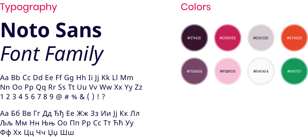
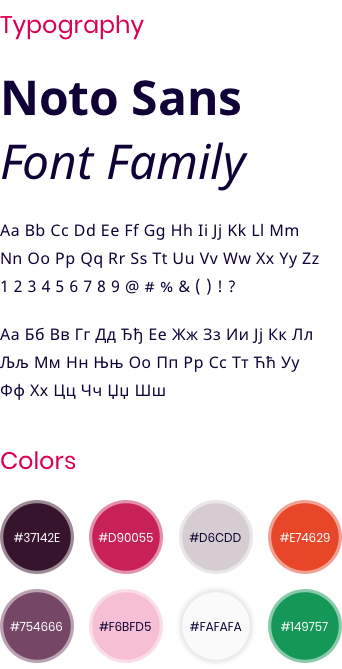
Since our users get used to the pink color of the tongue-based logo, we have decided to stay in those hues. While for the font, we have chosen the Noto font that supports almost all kinds of languages and different letters.
This section is a little bit complex but it has all the needed info, like languages that the user speaks, wants to speak, about me section, interests… We have added badges, and how many links the user has. Also, there is a possibility to add cover photos and some memory that is linked to that specific photo.









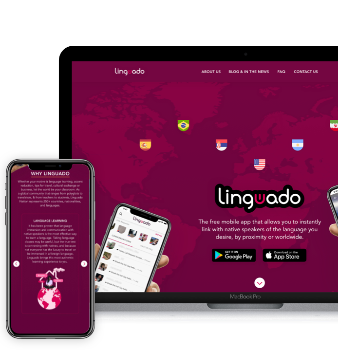
It is still in progress, but we wanted to make it fun and to interact with users in the way they need. So, we had to explain the reasons why Linguado is a great platform for learning languages, what kind of features can help them, some tutorials, etc.

It was a long journey to bring my startup project into life. This team has great experience, ideas and patience above all.
Alexander Max Caplan
Founder and CEO of Linguado

