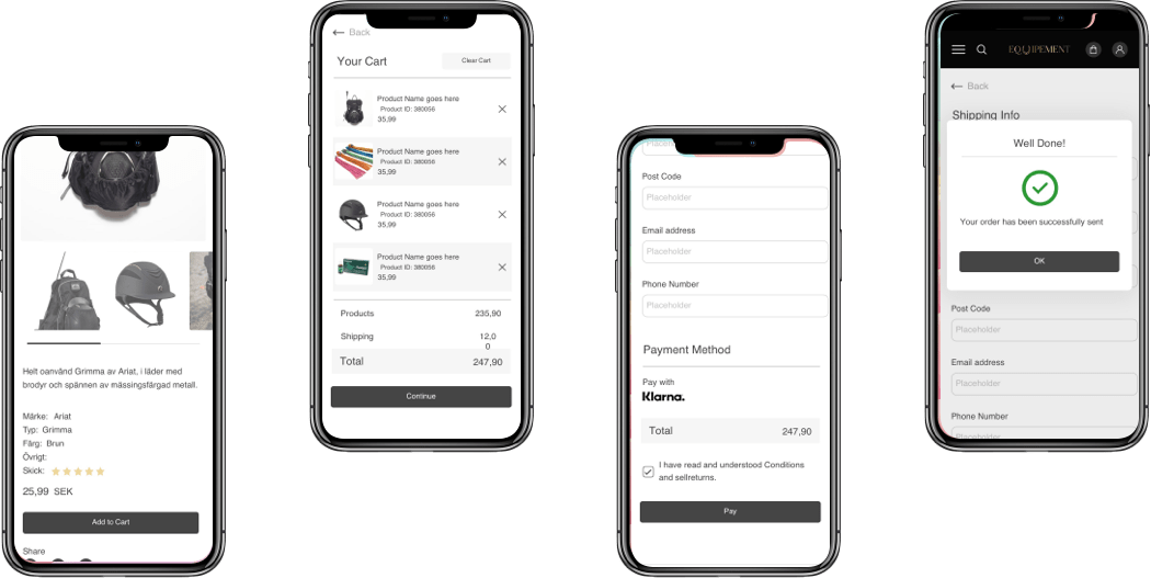

We were tasked to make the website with the opportunity of changing website elements. So, we created a changeable website - every element, photo, or text can be customized by clients. Also, we have implemented special authentication - users log in by scanning a QR code using the BankID app. For the payment method, the Swish payment system has been applied.
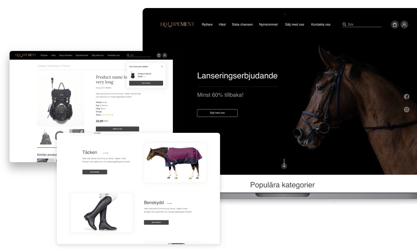













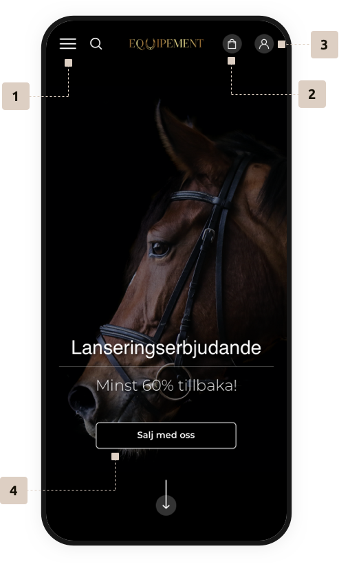
We imagined this website to have an easy-for-eye and calm look, but besides that we wanted an intuitive and easy user experience. Everything is divided into logic elements, and those elements are linked in a simple flow with no unnecessary details, so the user can focus on the task.
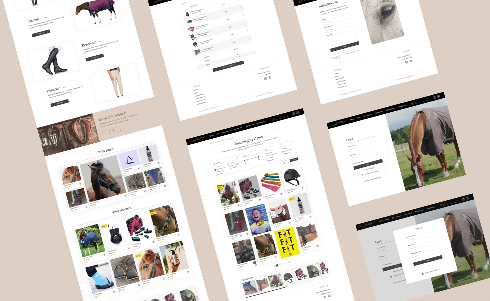
It has all important elements, like categories, news, selling option, etc.
It consists of elements that the user put in the cart, and it is easy for using
User is able to see all his previous sellings and buyings, and other basic stuff
Explanation about the platform + CTA button for selling horse equipment
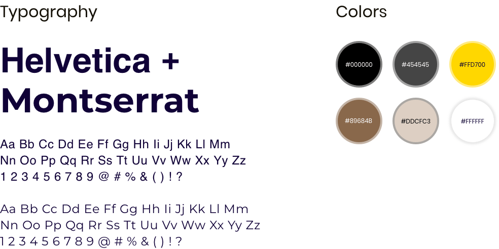
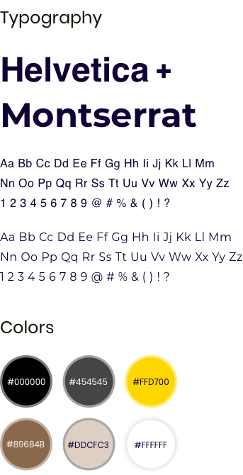
Since this is the platform for buying/selling horse riding equipment, we wanted to implement colors from nature, and apply the elegance of horses' appearance. So, that’s why we chose black and brown hues, in combination with timeless fonts Helvetica and Montserrat.
In the shopping section, users can apply various filters, so they can find exactly what they need. When users click to see more info, they will be taken to the product detail page. The main option is the possibility for users to control their shopping carts, by removing some products, and similar stuff. But if they want to proceed shopping - they will do that via the Swish system.
